
Landing page conversion basics for startups
 Baltej Singh8 min read
Landing page conversion basics are the few rules that turn a visitor into a counted next step: one clear offer, proof near the doubt, one primary action, and a weekly change you can measure. The URL fails when it argues with itself, when the button and the next screen disagree, or when edits pile up without a written guess. Ship a thin conversion URL you can explain. Then improve it with evidence.
Landing page conversion basics need a fold that decides
"Above the fold" means the first screenful someone sees before they scroll. That first screen must answer three questions without scrolling: what is this, who is it for, and what do I do next. If a phone user cannot answer those in a few seconds, the sections below rarely save you.
First-screen slot | Must show | Fail signal |
|---|---|---|
Offer line | Outcome in plain words | Clever slogan with no job |
Audience line | Who it is for | "For growing teams" with no stage |
Action | One primary button | Two equal buttons |
Reassurance | Proof or risk reducer | Empty space or vague claims |
Example offer line: "See cash and pipeline together for seed-stage founders." Example action: "Create a workspace" or "Book a 20-minute walkthrough." Secondary text links can exist; a second bright button usually steals the decision.
Read the fold aloud. If two cofounders speak different products, stop and fix the sentence before layout debates.
YC's essential startup advice keeps returning to talking with users and shipping. The fold is a compressed user interview. Borrow their words when you can.
Place evidence where skepticism starts
Skepticism starts immediately after the offer. Put evidence in that gap.
Evidence | Use when | Skip when |
|---|---|---|
Named quote | You have a real user who agrees to be named | You would need to invent the company |
Dated metric | You can define the numerator and window | The number only works without a date |
UI still | The screen shows the job without a tour | The UI needs a narrator to make sense |
Short clip | Motion clarifies the workflow | The file is a ten-minute dump |
Write the metric definition next to the number in your working doc even if the page shows a short label. Future edits should not quietly change what "active" means.
Honest early evidence beats borrowed authority. Design partners are fine when labeled as design partners.
Make the click path match the button
Landing page conversion basics include the screen after the click. Mismatch is a silent tax.
Button says | Next screen must | Common break |
|---|---|---|
Create workspace | Account or workspace create | Suddenly asks for a sales call |
Book walkthrough | Calendar with duration shown | Generic contact form |
Join list | Email confirm with the same promise | Unrelated newsletter signup |
Instrument one success event per path and name it the same in analytics and in your weekly note: workspace created, meeting booked, or email confirmed.
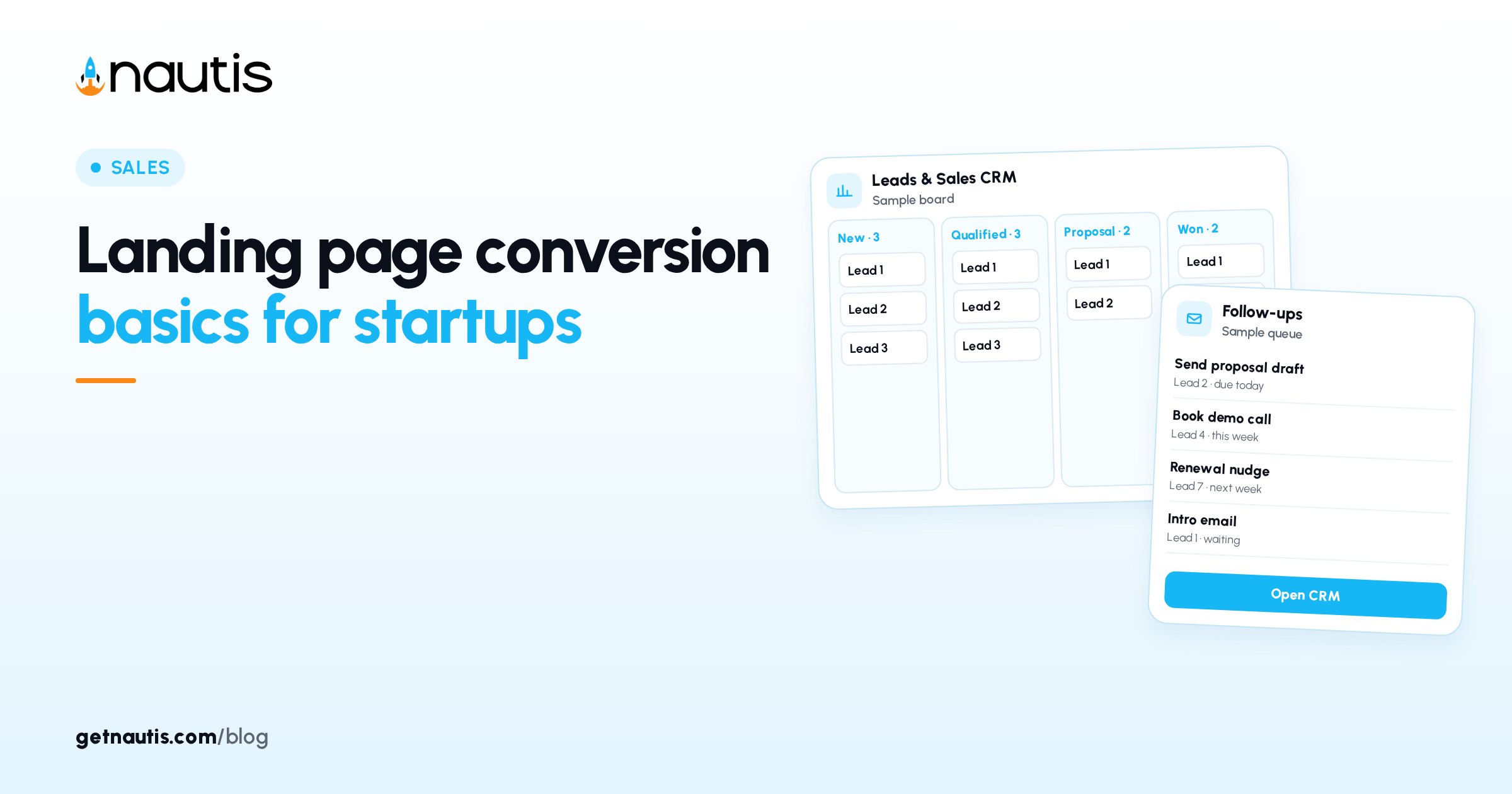
Use Custom forms when you need a few intent fields, and send qualified people into Leads CRM so follow-up is owned. Keep the field list short; every extra field is a chance to bounce.
Run a weekly single-change loop
Change one thing per week. Write the guess before you deploy.
Focus | Example change | Guess |
|---|---|---|
Offer line | Swap outcome wording | Clearer ICP recognition |
Evidence | New quote or still | Answers a specific doubt |
Button | Verb or destination | Less hesitation |
Fields | Remove one input | Higher completion |
Track visits, primary conversions, and rate in Sheets. Add a quality note from sales or founder calls: were conversations sharper or noisier? A higher rate of poor-fit meetings is not success.
After two quiet weeks, revert or replace the change. Do not layer three untested edits into one release. Date each live version in Notes so spikes can be matched to copy.
Message match from click to hero
If traffic comes from ads, posts, or outbound, reuse the same offer words on the hero. When the click line and the fold disagree, people feel tricked even if both lines are true in isolation. Log the source line beside conversion rate. When the rate falls, check match before you redesign.
Speed and distraction
Performance and chrome matter as much as adjectives. Compress the hero asset, defer below-fold media, delay chat widgets until the button is visible, skip autoplay with sound, and test on a mid-range phone over cellular. If the button is slow to appear, fix that before another rewrite.
What this page should refuse
Extra sections feel thorough and blur the decision.
Refuse for now | Why |
|---|---|
Full feature matrix | Belongs after desire exists |
Long plan-comparison blocks | Belongs on a separate URL with a different job |
Long essay blocks | Dilute the ask; publish elsewhere |
Equal-weight nav to five products | Turns a conversion URL into a sitemap |
Stakeholders will request more. Park requests with a date and require a failed experiment before adding a section. Anxiety is not evidence.
Ownership on the conversion URL
Name one owner for the live offer line and the weekly change. Without an owner, every stakeholder edits in parallel and the experiment log dies. Put the owner initials in the sheet row for the current week.
The owner also rejects off-cycle edits. Emergency fixes for broken links or tracking are allowed. Copy rewrites mid-week are not, unless the page is clearly wrong for legal or factual reasons.
Sample weekly row
Field | Example |
|---|---|
Week of | 2026-11-03 |
Live offer line | See cash and pipeline together for seed-stage founders |
Change | Replaced anonymous quote with named design-partner quote |
Guess | Named proof reduces "is this real?" drop |
Visits | 420 (illustrative example) |
Primary conversions | 31 (illustrative example) |
Rate | 7.4% (illustrative example, not a benchmark) |
Quality note | Two calls clearer on ICP; one still asked for enterprise SSO |
Decision | Keep proof; next week test shorter form |
Copy that row shape and keep it boring. Boring rows are how landing page conversion basics survive a busy month.
A ten-day ship plan
Days 1-2: draft three offer lines from real buyer phrases; pick one.
Day 3: gather proof you can defend; delete the rest.
Days 4-5: build the thin page, one path, tracking on.
Day 6: fold check on phone and laptop; fix what fails.
Day 7: show five ICP readers; ask only what the product does and for whom.
Days 8-9: repair misunderstandings in offer or evidence; avoid a full redesign.
Day 10: send a small controlled traffic batch and start the weekly change log.
Keep the page honest after launch
Each month, compare the hero line to notes from live calls. When buyers describe a different job than the fold, rewrite the offer before you buy more clicks. Paid traffic on a wrong offer only measures spend speed.
Landing page conversion basics stay boring on purpose: a decisive fold, proof at the doubt, a matched next step, and one measured change a week.
Treat soft conversions carefully. Newsletter joins and PDF downloads can inflate vanity rates while starving the primary path. If you must offer a secondary download, put it below the primary action and exclude it from the headline conversion rate you review on Monday.
When a week looks too good, audit traffic quality before celebrating. Bot spikes, internal clicks, and a single partner blast can fake a breakthrough. Segment by source in the sheet so one loud channel cannot hide a weak fold.
Founders often rewrite the fold after one awkward sales call. Wait for a pattern of three similar misunderstandings before you burn the offer line. One anecdote is a note; three are a rewrite trigger.
If design partners hate the screenshot but strangers convert, prefer the stranger data for this URL. Internal taste is useful for product quality and dangerous as the only conversion referee.
On day ten, resist the urge to open five channels at once. One controlled source teaches whether the fold works. Many sources teach noise. After two solid weeks of data, widen distribution.
If legal review is required for claims, park unverifiable metrics offline until counsel or a cofounder signs off. A slower honest URL beats a fast one that needs a quiet rewrite after the first serious buyer.
Landing page conversion basics are a habit of deciding, measuring, and refusing clutter. Keep that habit visible in the sheet and the URL will stay teachable.
Define the analytics event names before launch and refuse to rename them mid-quarter. Renaming "workspace_created" to "signup_ok" mid-test breaks week-over-week reads and invites false wins.
When the primary path is booking, show duration and time zone beside the button. Surprises after the click show up as no-shows, which people then blame on copy.
Archive prior offer lines in the sheet instead of overwriting history. You will want the old rate before bringing a nostalgic line back.
If a week spikes, export raw source counts before you change the fold. Spikes without a source story are usually instrumentation or a one-off blast, not a creative breakthrough.
Pair the weekly rate with a simple notes column for "what we heard on calls." Numbers without call texture lead teams to optimize for curiosity clicks that never become conversations.
If two weeks of controlled traffic still cannot explain the offer to ICP readers, pause paid distribution. Fix the fold with interviews first. Landing page conversion basics assume the sentence is true; they cannot invent product clarity.
Frequently asked questions
What are landing page conversion basics?
A decisive first screen before the scroll, evidence near doubt, one primary call to action that matches the next screen, and a weekly measured change. Thin conversion URLs you can explain beat broad layouts that argue with themselves.
How many calls to action should an early conversion URL have?
One primary button. A quieter text link can exist. Two equal bright buttons usually split the decision and muddy your conversion rate.
How often should we rewrite the conversion URL?
Change one element per week and write the guess first. Revert or replace after about two quiet weeks. Avoid stacking untested edits into a single release.
What evidence belongs above the fold?
Above the fold means before the scroll. Use named quotes, dated metrics you can define, clear UI stills, or a short clip. Label design partners honestly. Skip numbers you cannot defend.
Sources
- YC's essential startup advice. Checked on November 1, 2026.
Baltej Singh is a serial entrepreneur, technology leader, and Founder & CEO of Nautis and DemoVexa, with over 16 years of experience building software products, SaaS platforms, and startups. Previously the Co-Founder & CTO of SanchiConnect, he has worked extensively in the DeepTech startup ecosystem, connecting with 200+ venture capital firms and supporting a network of 4,000+ startups. Passionate about AI, automation, and entrepreneurship, he focuses on building innovative products that solve real-world problems and help businesses grow.